
RainFall

Develop Rainfall Brand
client
RainFall
Role
Creative Director

Rainfall Eco-Friendly Paint & Primers - Brand Creation, Ads & Packaging System
The Challenge
Rainfall set out to enter the highly competitive paint and coatings market with a unique value proposition: an eco-friendly line of paints and primers that deliver performance without harmful chemicals. As a new player, the brand needed a strong identity system that conveyed sustainability, innovation, and trustworthiness from day one.
The Approach
The focus was on building a brand from the ground up that would both stand out on retail shelves and connect with environmentally conscious consumers. This meant designing a visual identity that balanced the professionalism and durability expected from a paint brand with a clean, modern aesthetic that reflected Rainfall’s eco-first philosophy.
The Execution
I developed a complete creative foundation and marketing toolkit for Rainfall, including:
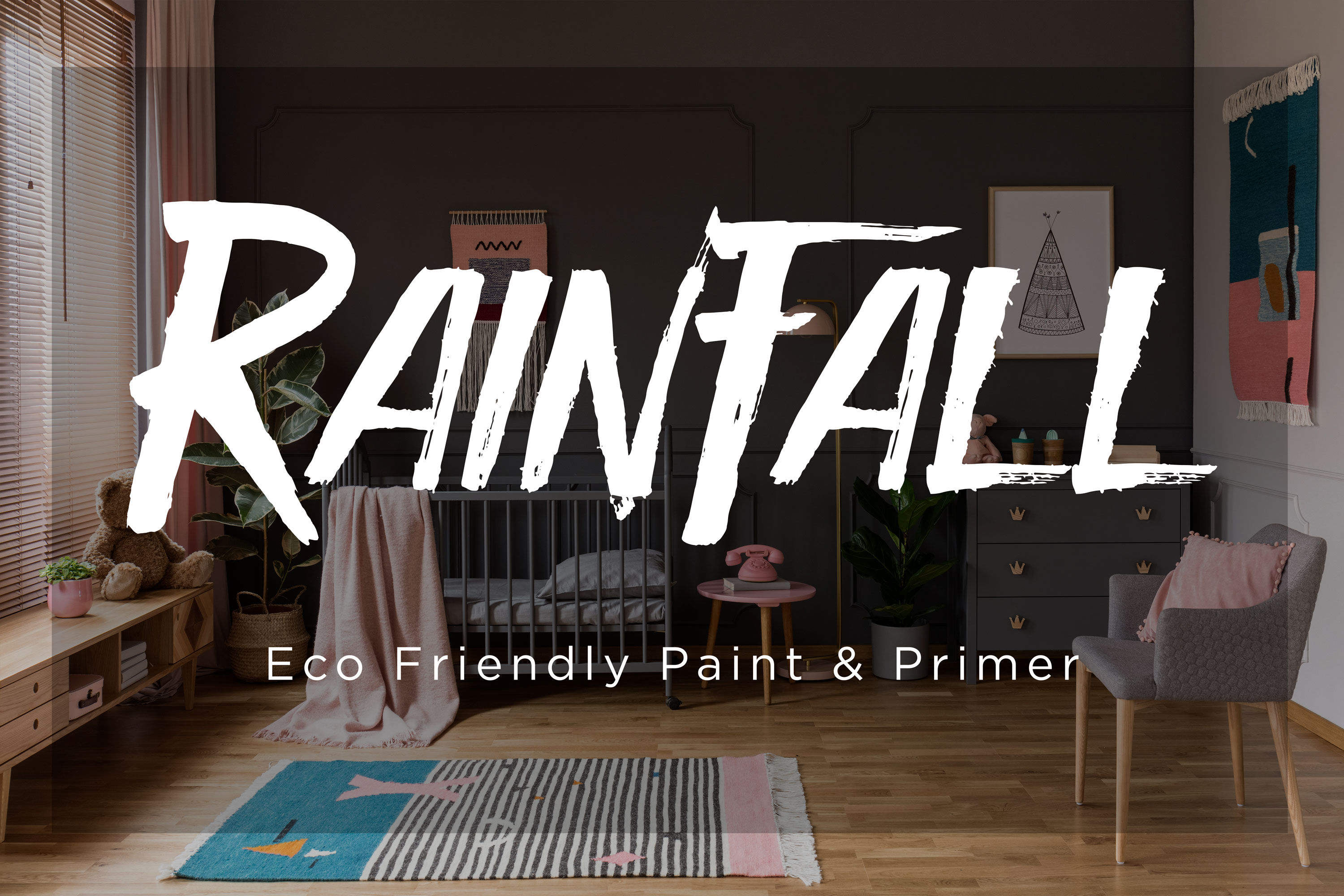
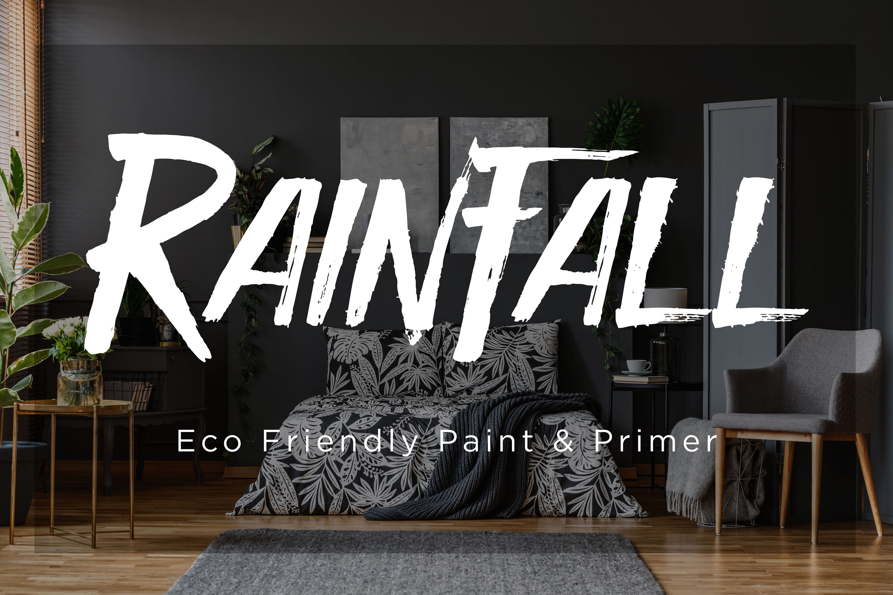
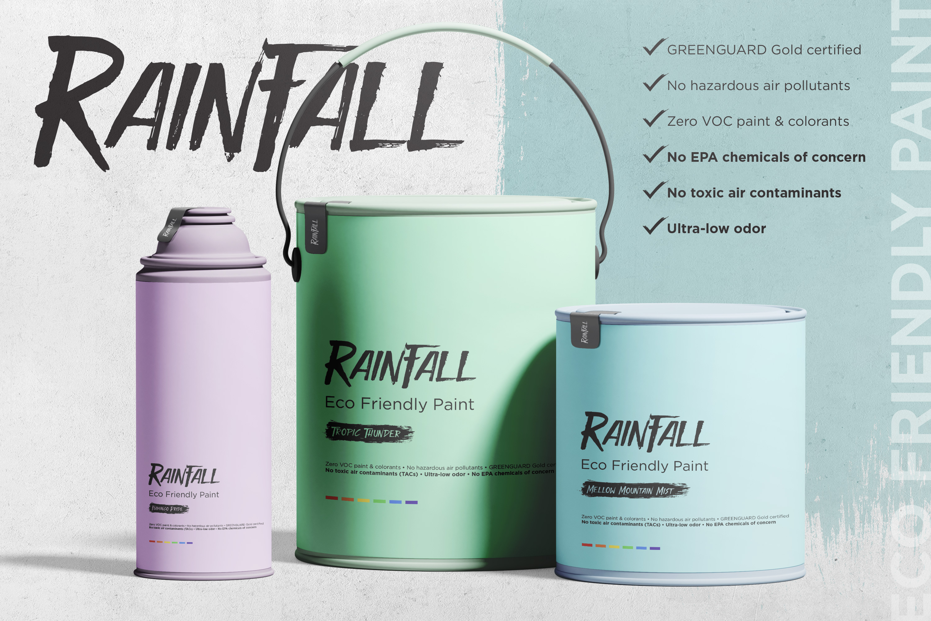
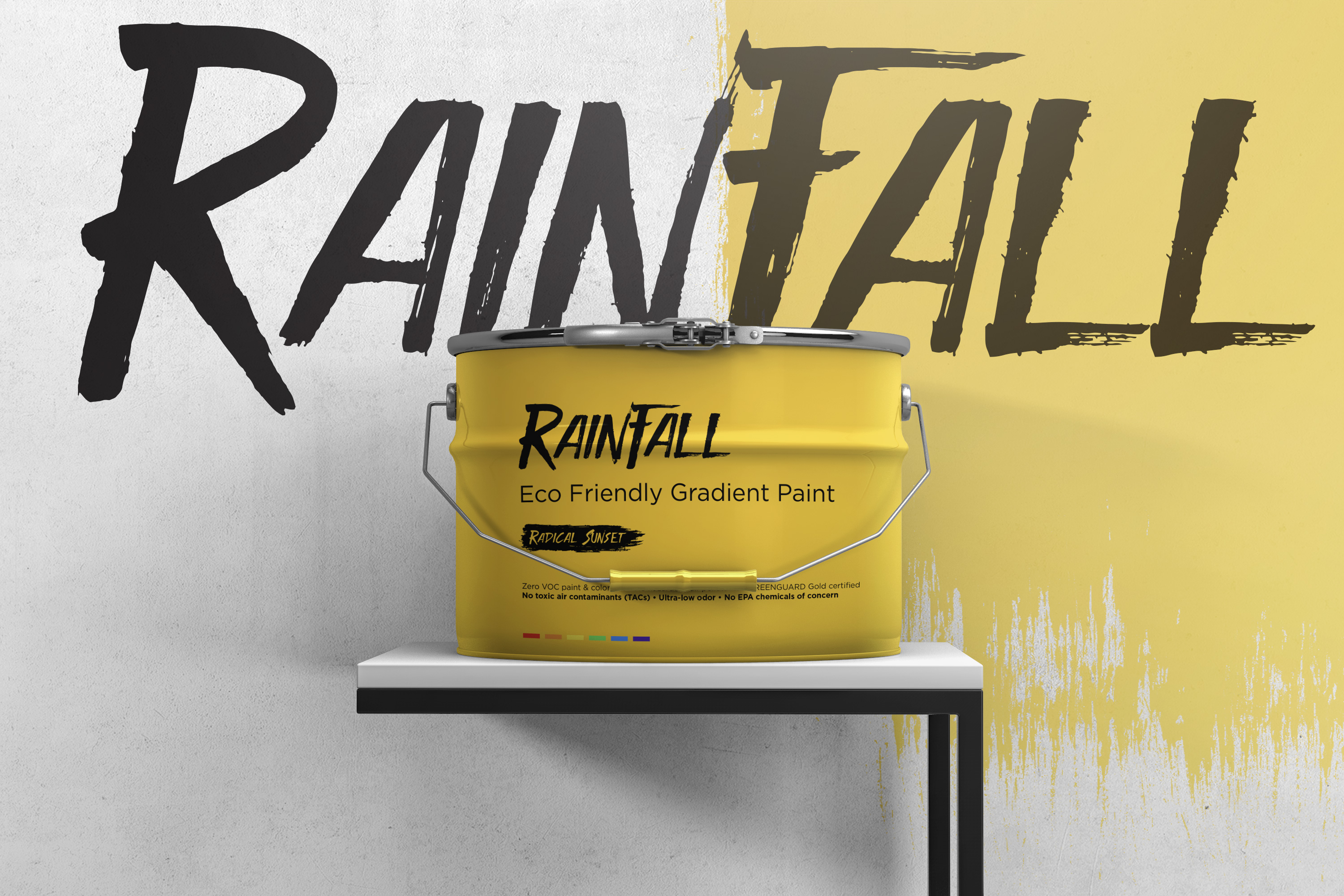
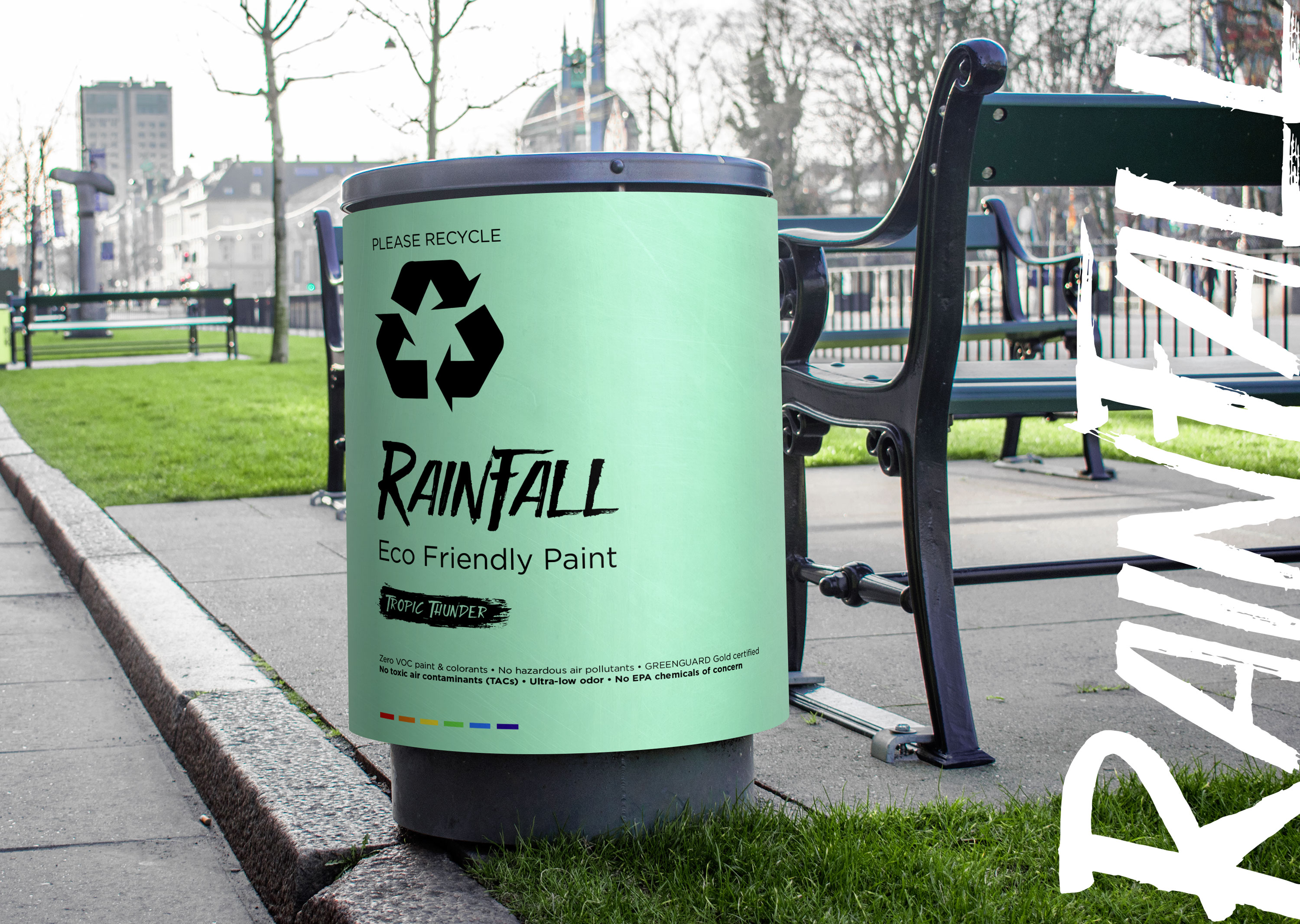
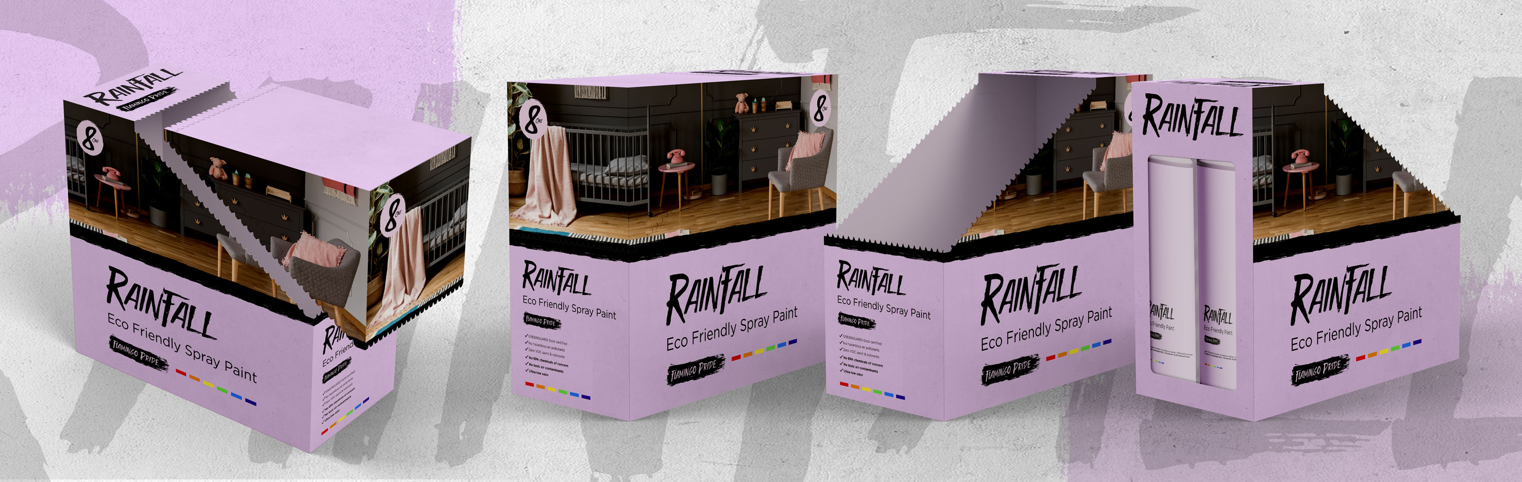
- Brand identity system that captured the eco-friendly ethos through clean typography, natural color palettes, and modern graphic elements
- Packaging design system for cans and labels, ensuring each product line was easy to navigate, visually cohesive, and instantly recognizable on the shelf
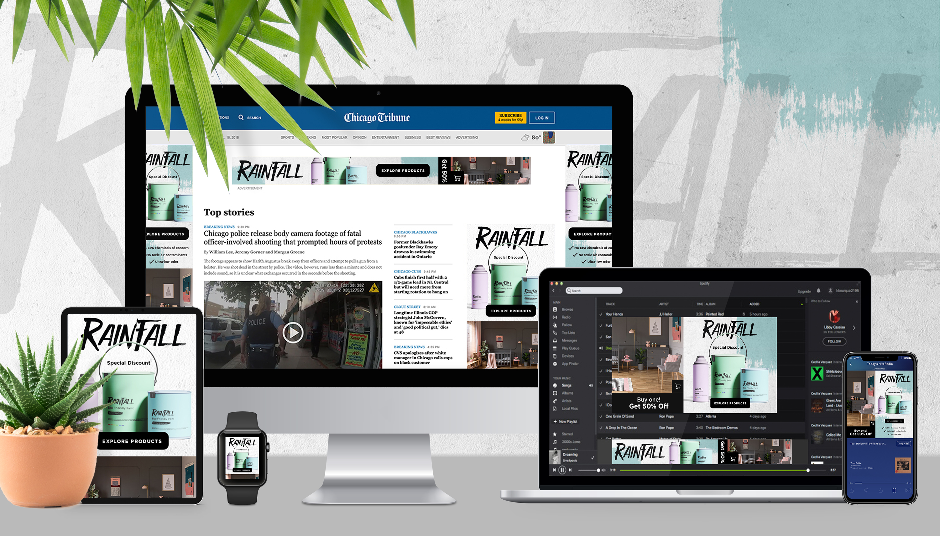
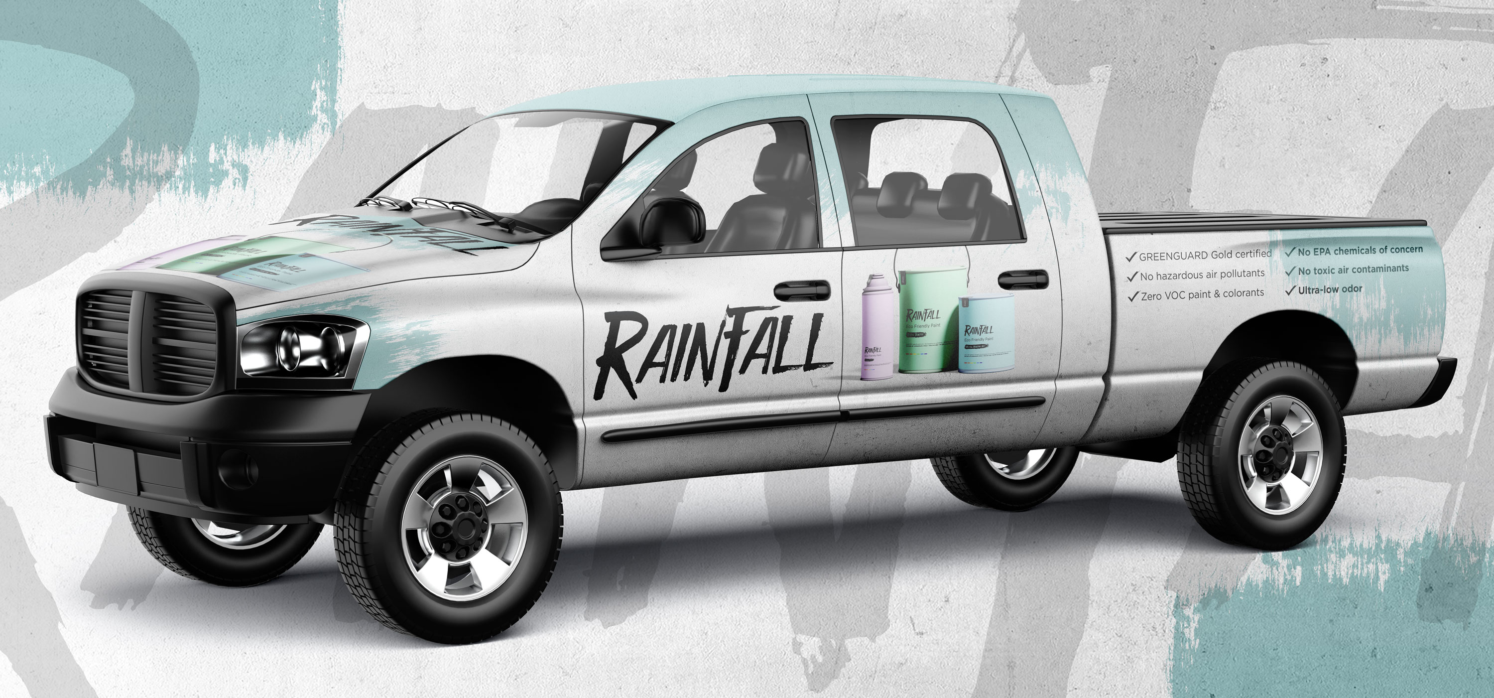
- Digital advertising assets including banner ads, display ads, and promotional graphics for online campaigns
- Marketing collateral and ad concepts that reinforced Rainfall’s commitment to sustainability while driving awareness and purchase intent
The Impact
The new identity and packaging system established Rainfall as a credible, modern eco-friendly alternative in the paint and coatings market. By unifying packaging, digital, and advertising under a single creative direction, the brand built early recognition, differentiated itself from competitors, and positioned itself for long-term growth.
Location
3044 N Oakley Ave.
Chicago, IL 60618
© 2024 Daniel Curran Designs