
Tuffy Industrial Finishings

Redesigned Tuffy packaging for retail, making products clear, bold, and shelf-ready.
client
Fenix Specialty Performance Coatings
Role
Creative Director


Tuffy - Label System
The Challenge:
TCI Coatings approached me because they were expanding Tuffy Industrial Finishes into retail after securing a deal with NAPA. Their current packaging was designed for industrial buyers, lacked cohesive branding, and did not clearly differentiate product types or communicate benefits. They needed a retail-ready system that would stand out on crowded shelves, convey professional quality, and make product selection intuitive for new retail customers.
The Approach:
I focused on creating a unified, visually striking brand system that balanced industrial strength with retail appeal. The strategy centered on hierarchy and differentiation, clear benefit-driven messaging, and a cohesive design language that could scale across all product types while instantly signaling quality and reliability.
The Execution:
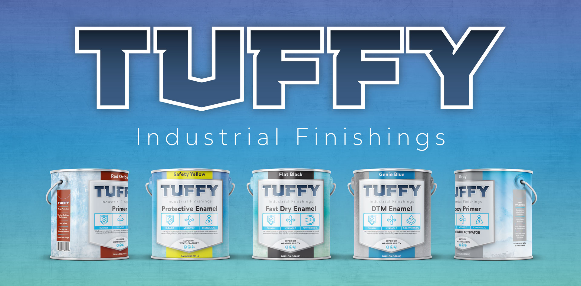
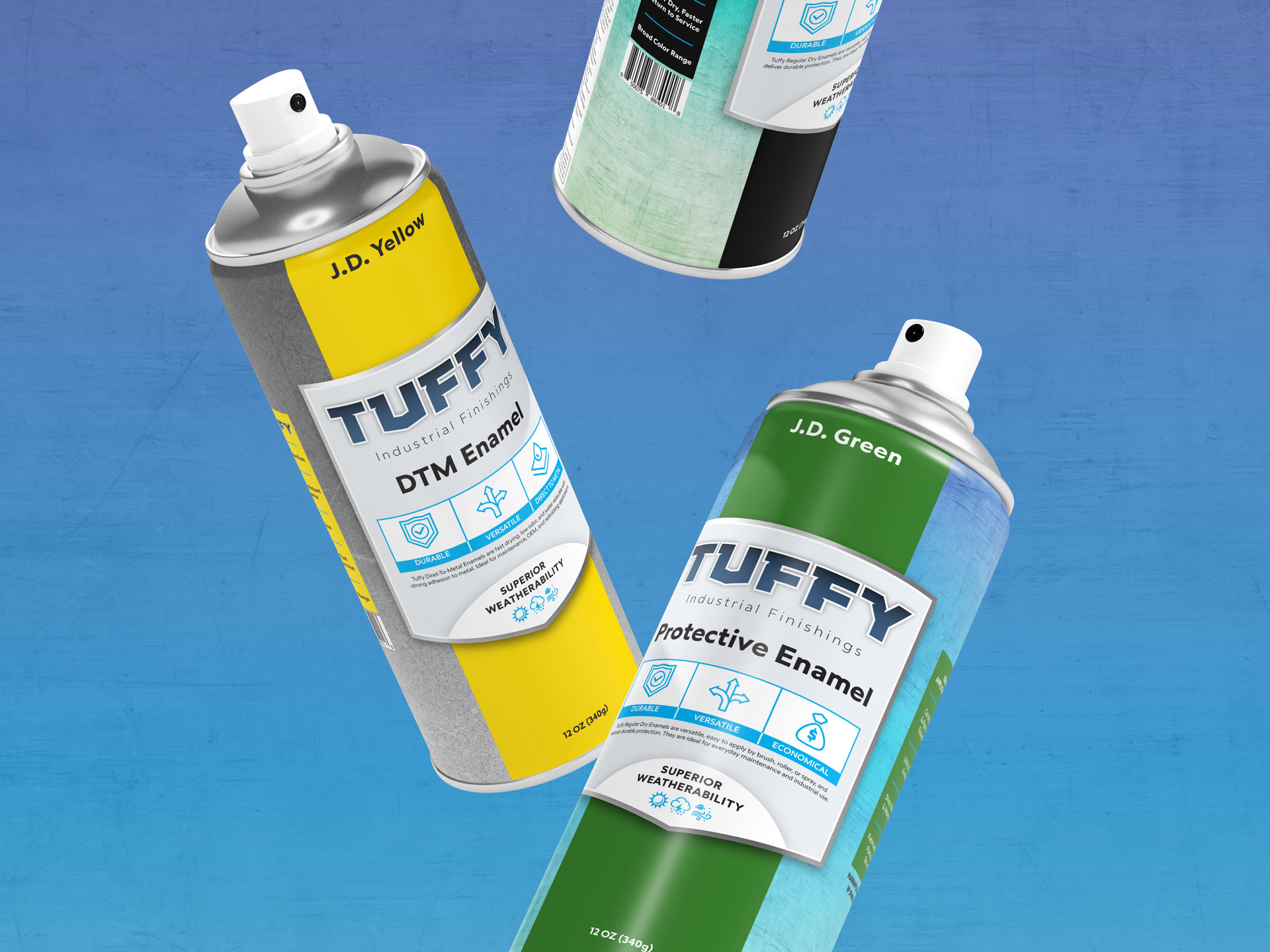
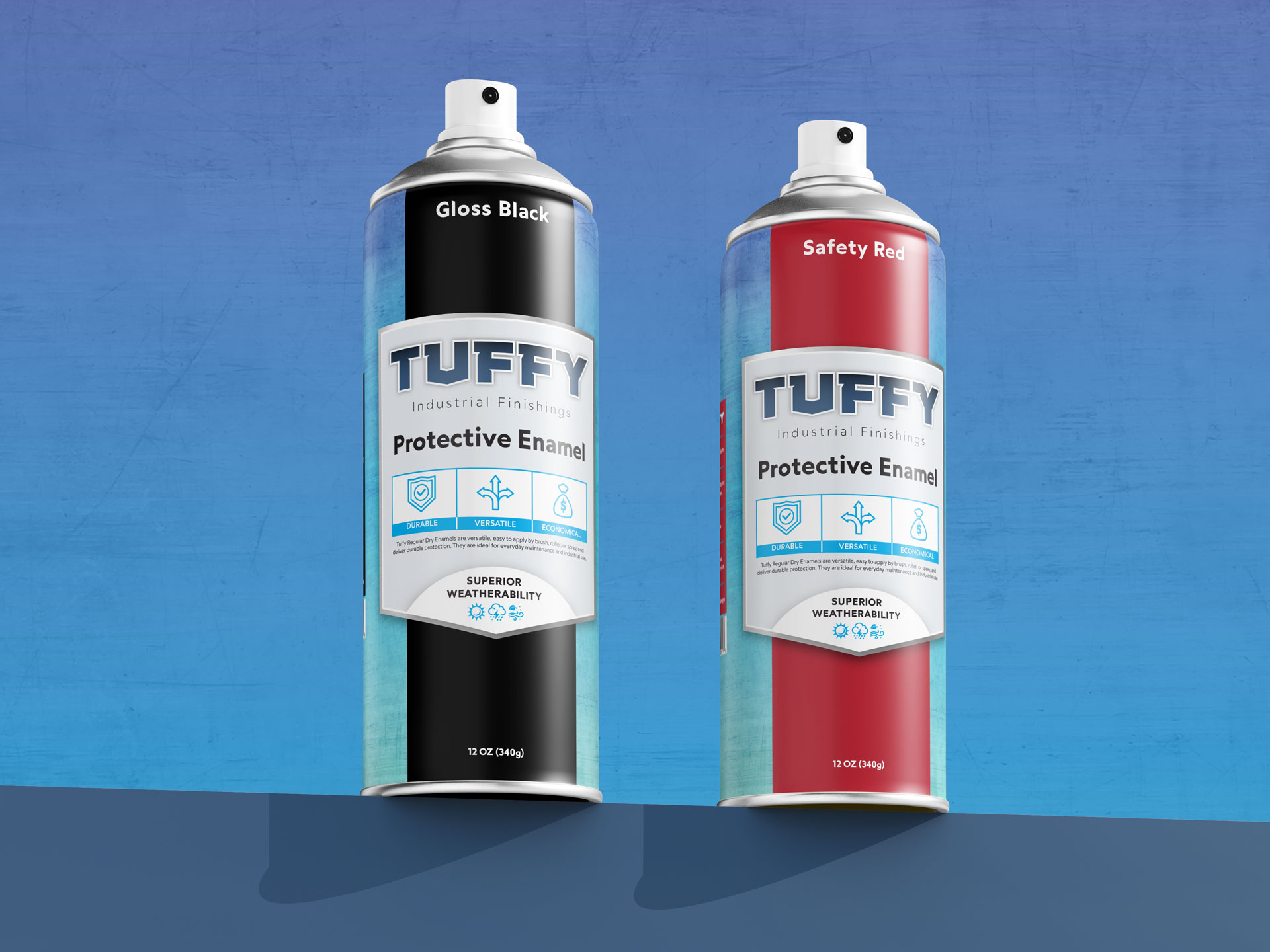
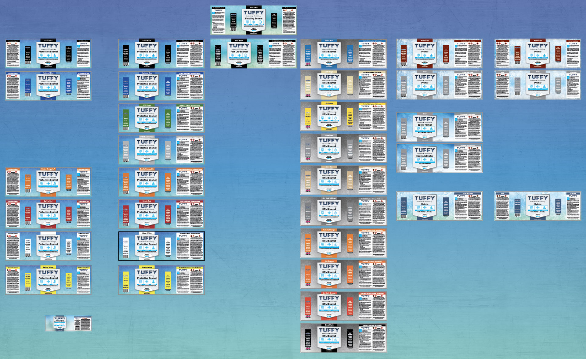
- Designed a shield-shaped crest across every can to communicate durability and industrial strength.
- Added metal-textured edges for a premium, professional feel.
- Introduced color-coded bars behind the shield to differentiate product types at a glance.
- Developed a custom shield-inspired logo font and simple benefit-focused icons to clearly communicate technical features.
- Applied subtle textured gradients in backgrounds to distinguish product lines while keeping the system cohesive.
- Structured label information for maximum clarity: product type, benefits, usage instructions, and safety info presented in a clean, logical flow.
The Impact:
The redesign gave Tuffy a strong retail presence that stood out on NAPA shelves and other retail outlets. Product differentiation was immediately clear, making selection faster and easier for customers. Benefit-driven design boosted purchase confidence, and the system established a scalable foundation for future product expansions, unifying the Tuffy brand across industrial and retail channels.
Location
3044 N Oakley Ave.
Chicago, IL 60618
© 2024 Daniel Curran Designs