
Robopac & Midland Event

Designed all presentations and event visuals for a key international meeting in Italy
client
Robopac & Midland
Role
Creative Director
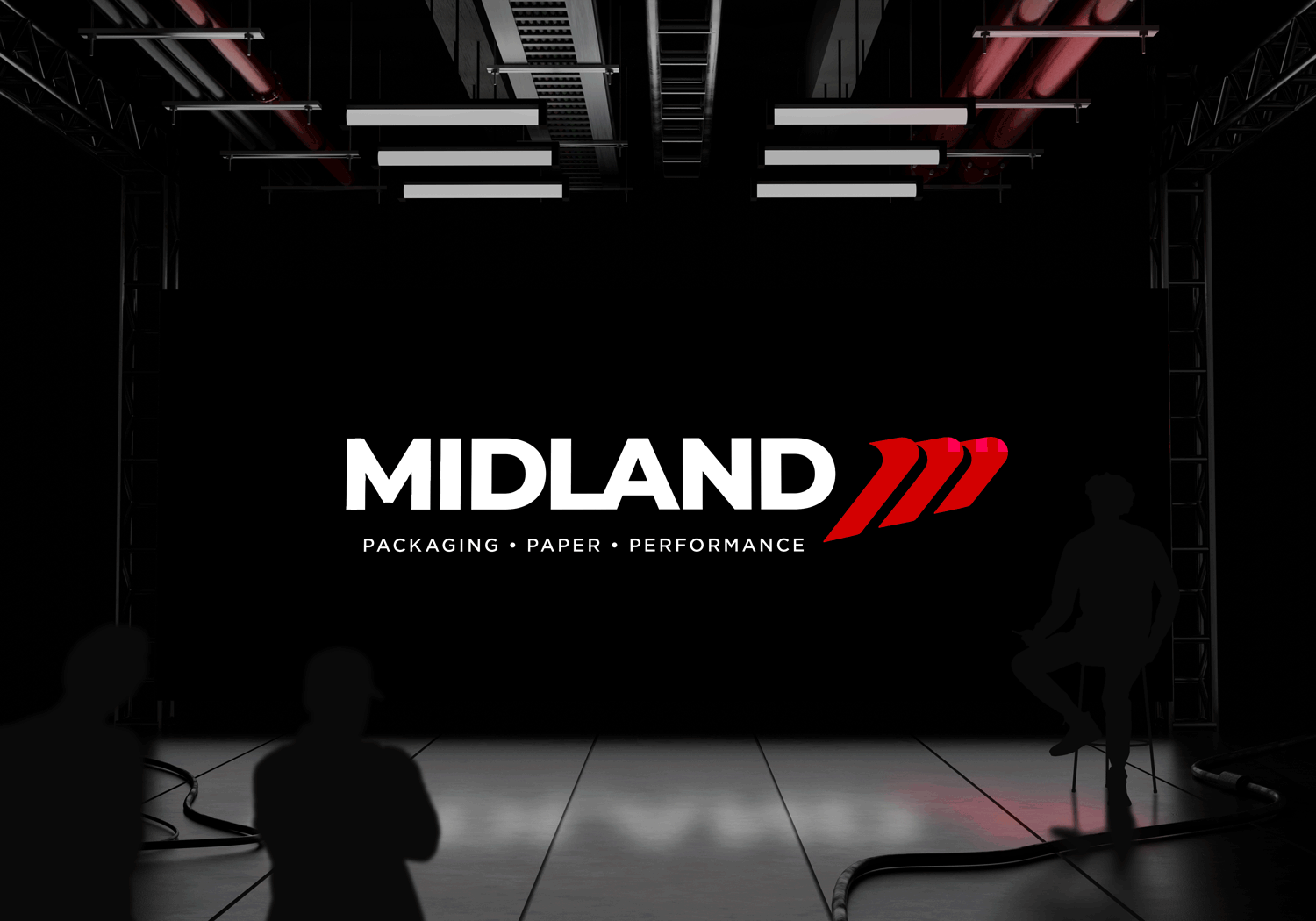
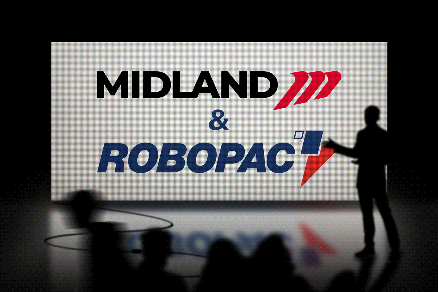
Robopac & Midland - International Meeting in Italy
The Challenge
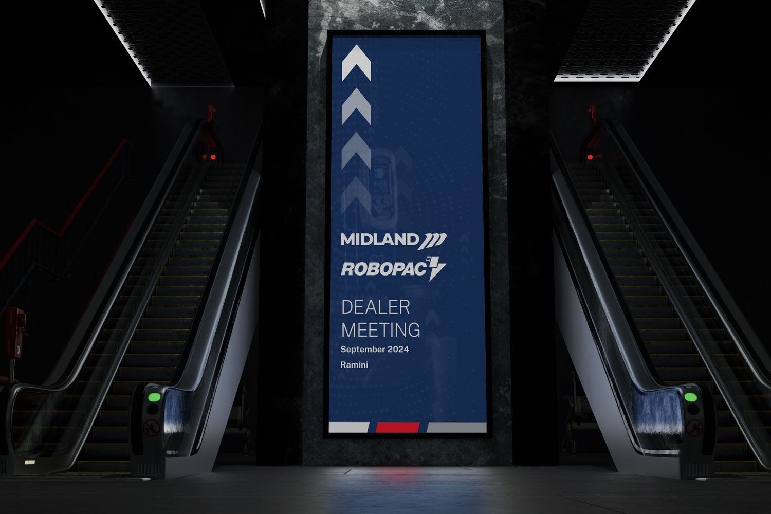
The challenge was creating a bold, visually striking experience for a high-profile international meeting in Italy. The event needed to feel impactful and memorable, with graphics that were instantly recognizable, highlighted the most important information, and brought together two distinct brands in a cohesive way.
Research & Insight
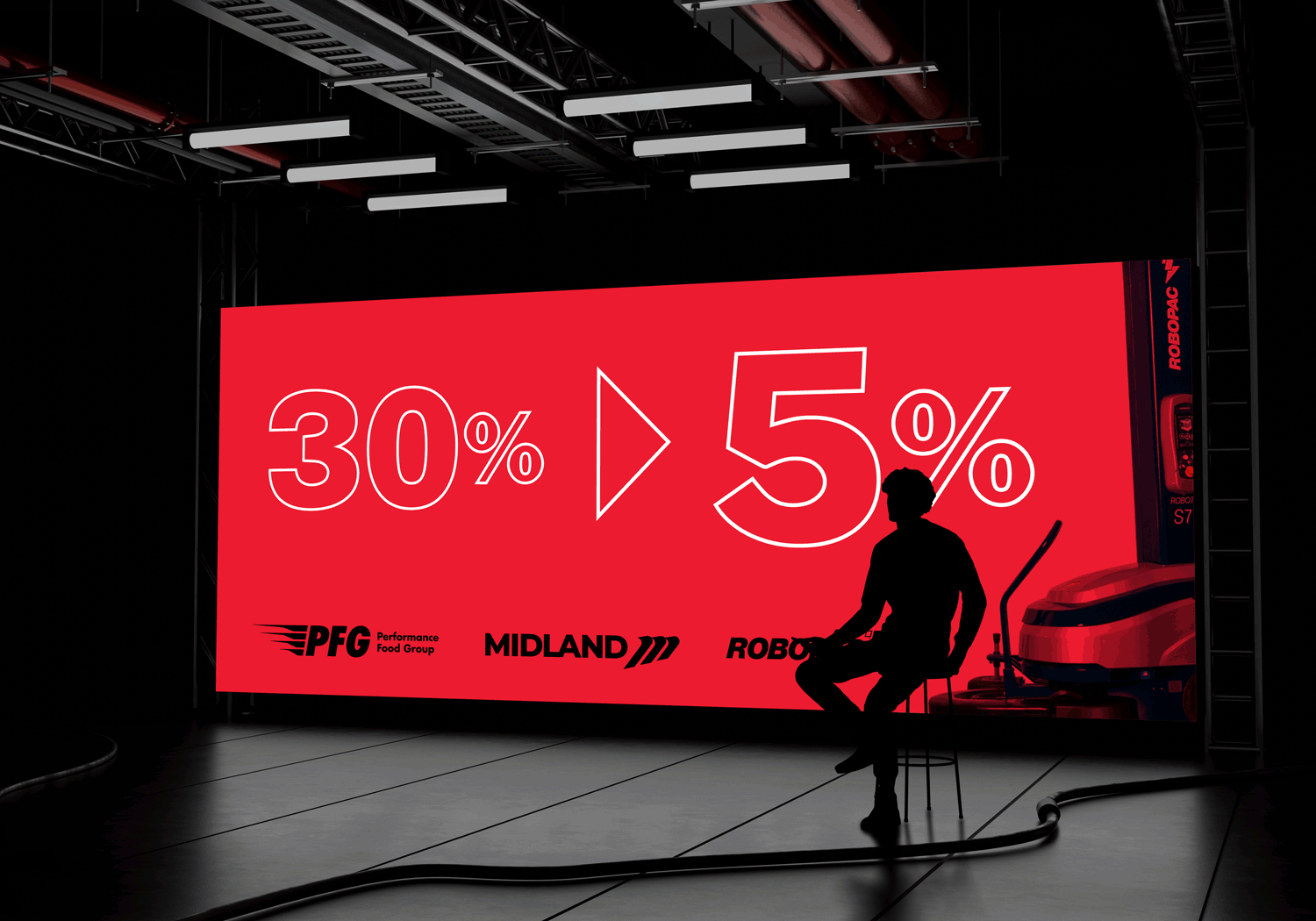
Robopac and Midland had very different brand identities. Robopac favored tech-forward, dynamic visuals, while Midland leaned more structured and corporate. The insight was that by focusing on bold design, clear hierarchy, and shared visual principles like color accents and typography, we could unify the brands while delivering a high-energy, memorable event experience.
The Strategy
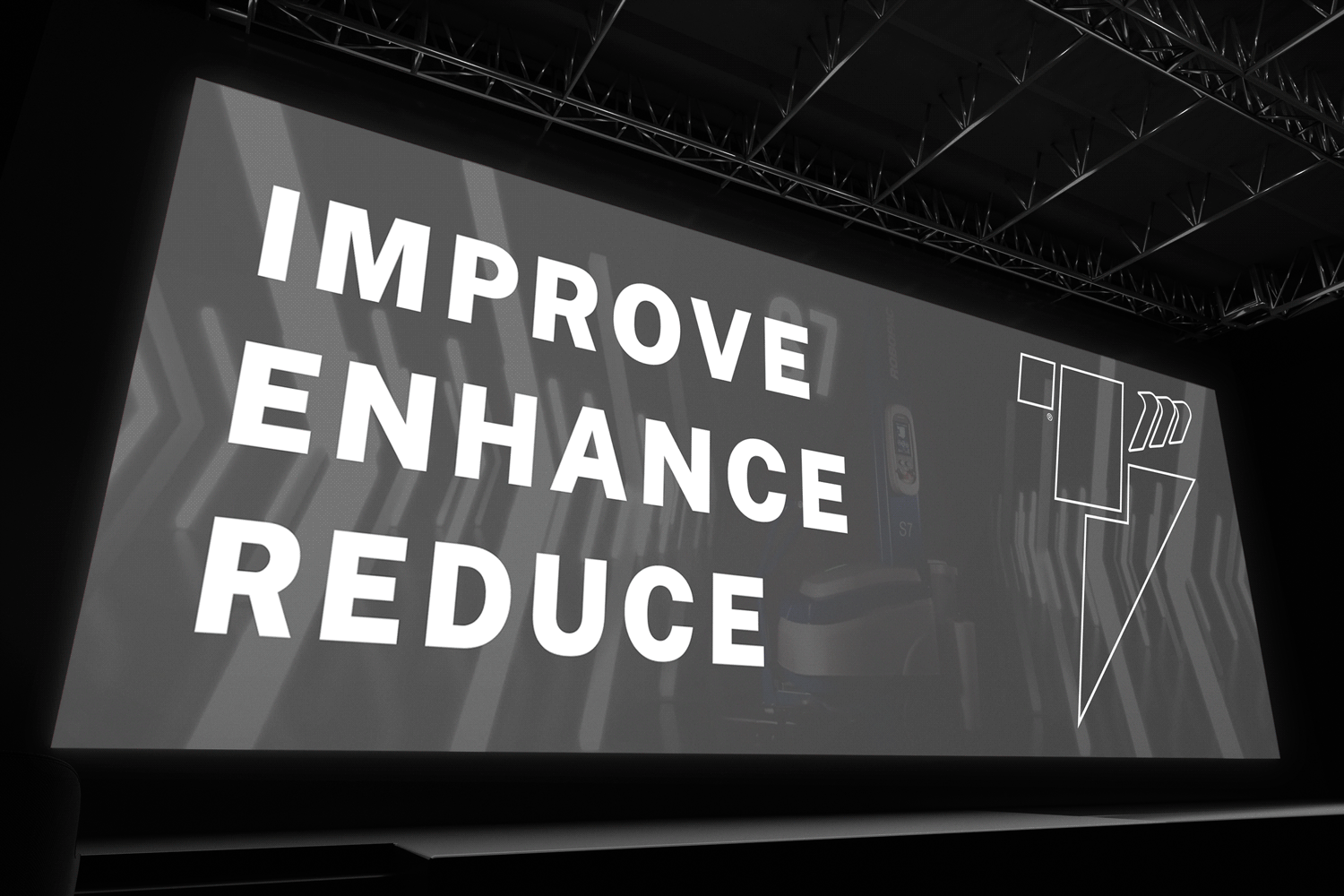
The strategy was to prioritize scale, clarity, and visual impact. Every visual element needed to grab attention, make key information stand out, and reinforce the presence of both brands. The goal was to create an event that felt polished, professional, and truly immersive.
The Execution
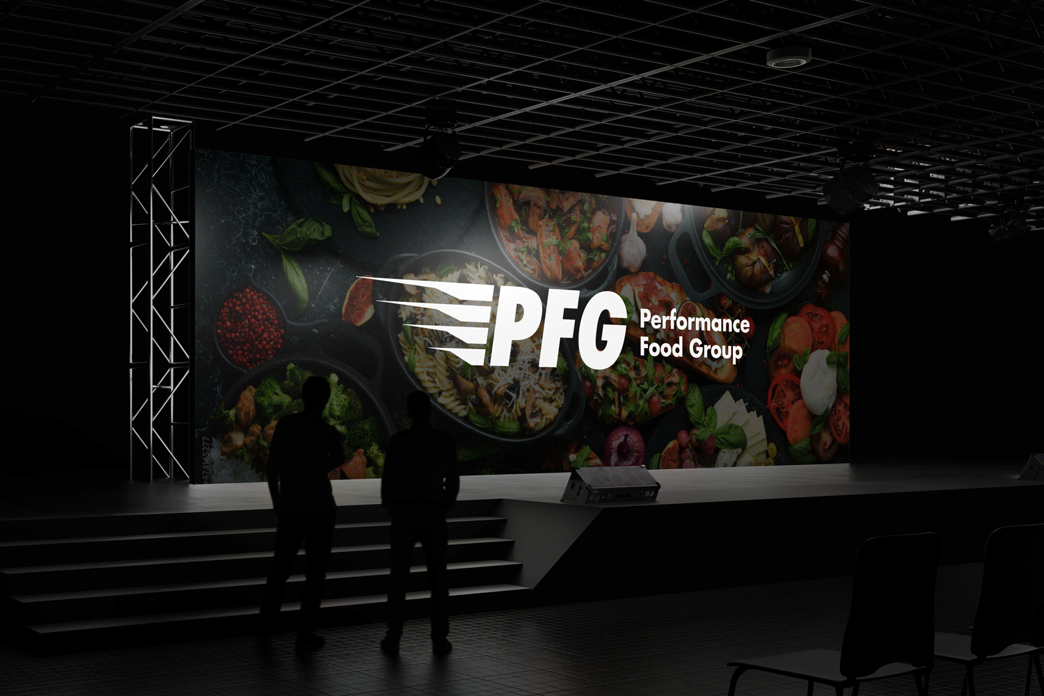
I designed event graphics and presentations, applying the combined brand elements consistently across large-format displays, slides, and supporting materials. Bold imagery, clean layouts, and thoughtful hierarchy ensured the visuals were engaging, easy to follow, and impactful from every angle.
The Impact
The event successfully delivered a visually cohesive and memorable experience. Attendees could instantly recognize key information, and the bold, polished graphics elevated the presence of both brands. The design created a high-energy environment that left a lasting impression and set a new standard for future collaborative events.
Location
3044 N Oakley Ave.
Chicago, IL 60618
© 2024 Daniel Curran Designs